BackPortfolio / Slides
Slides
From documentation to a visual system
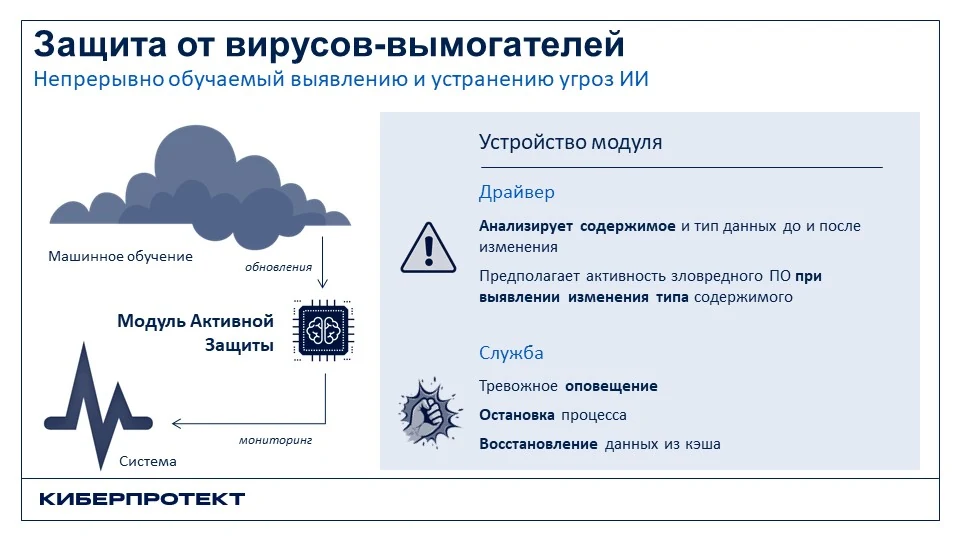
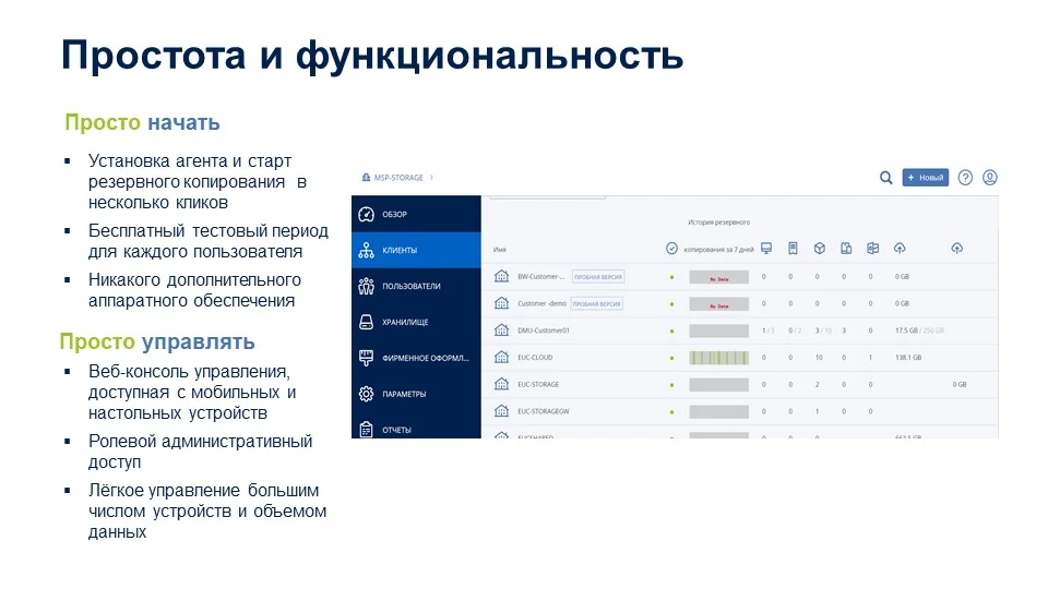
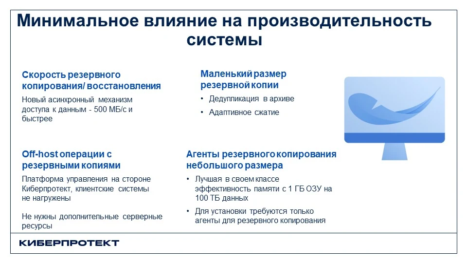
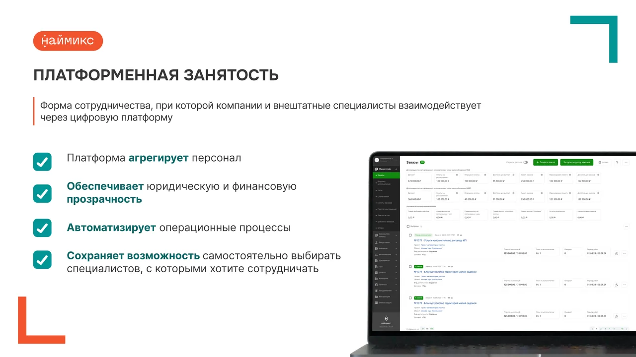
Before I took over, the organisation's slides looked like technical documentation. Dense text, rigid frames, tiny icons. The information was there, but hard to take in.
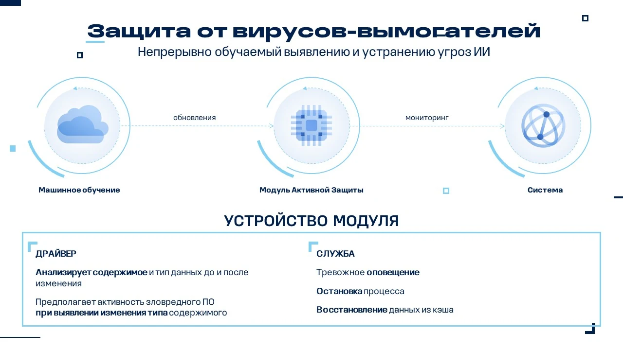
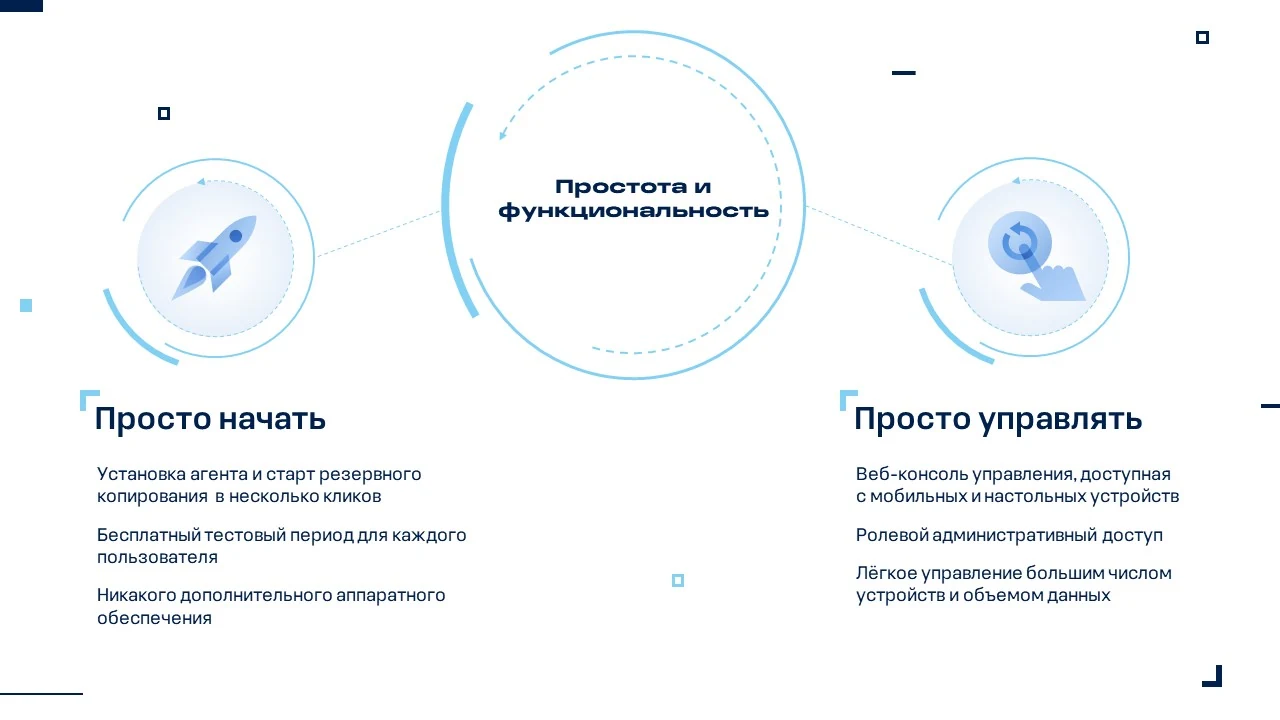
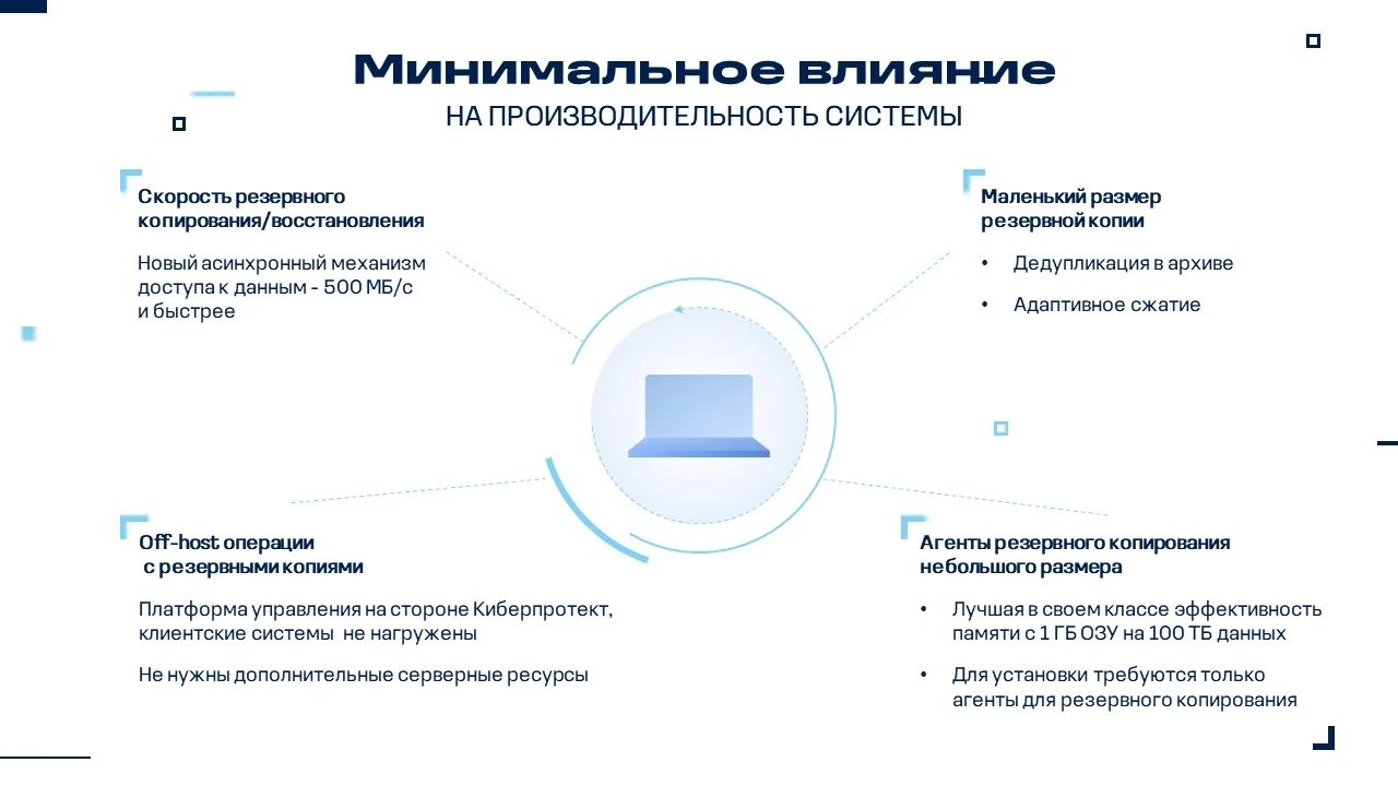
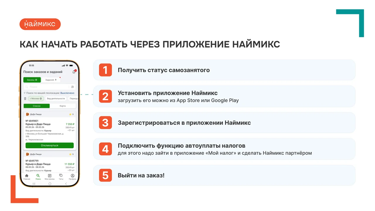
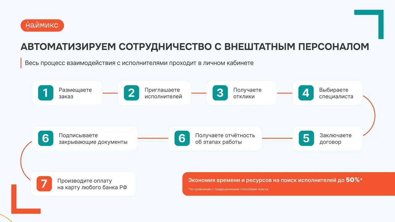
I rebuilt the structure and the visual language. A central image on every slide, a modular grid, large typography, breathing room. The ransomware protection diagram reads as a sequence, the module's design is clear at a glance. The slides work both on a projector and on a laptop, guiding the eye through the product's logic.

B2B presentation: redesigning the visual system
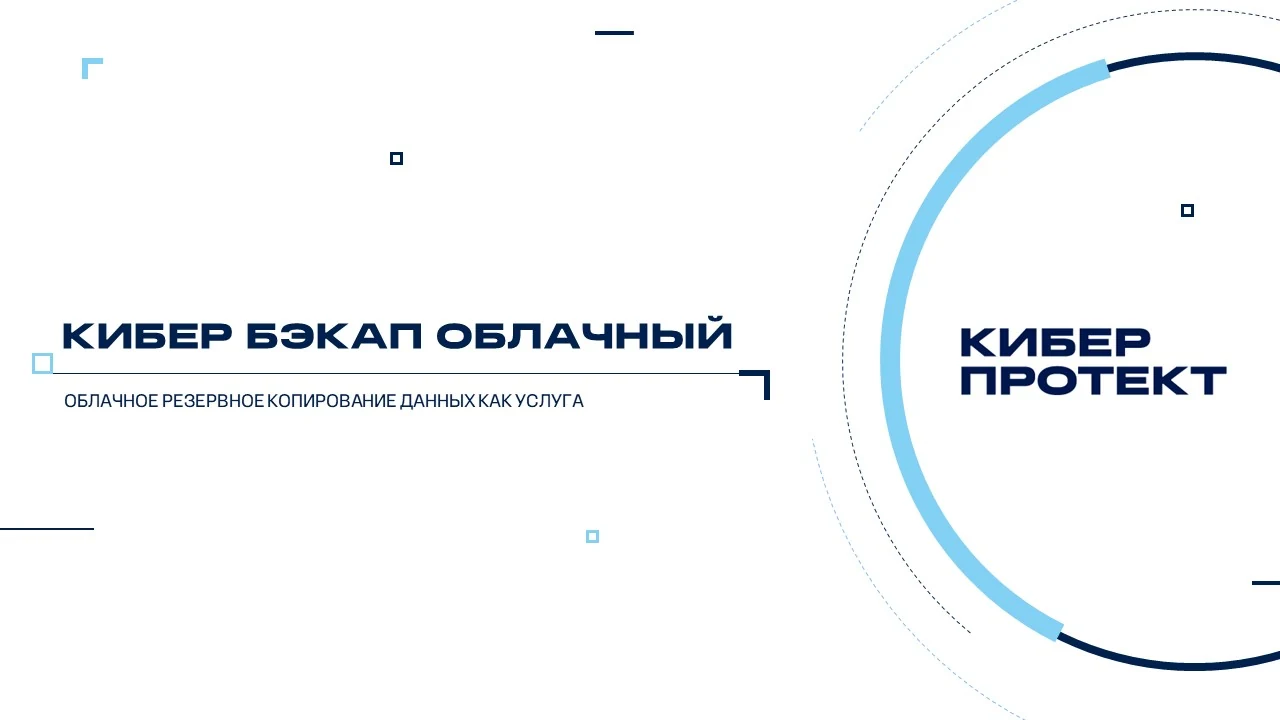
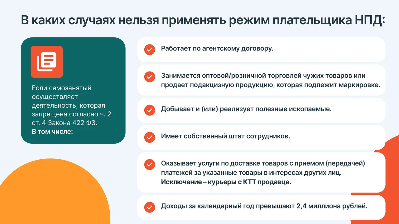
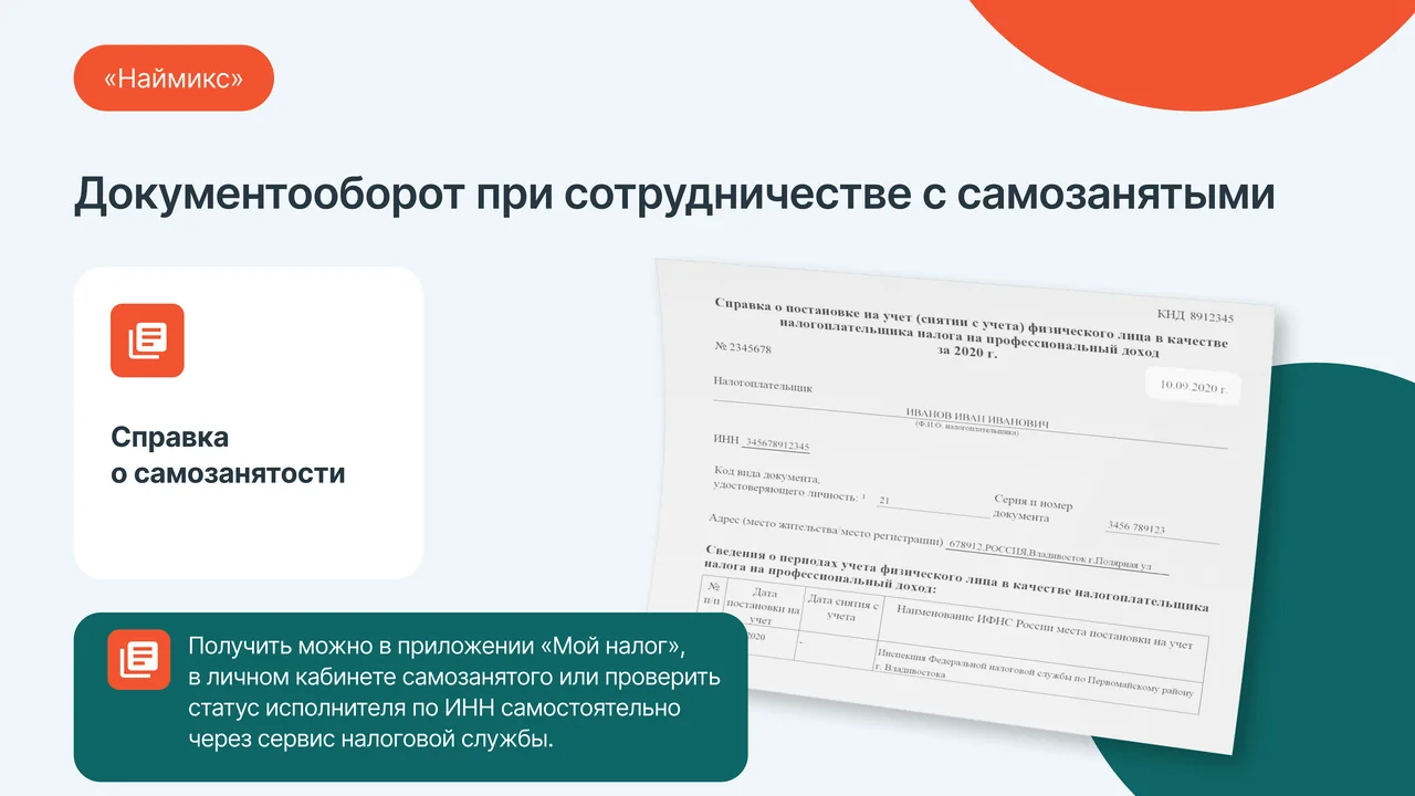
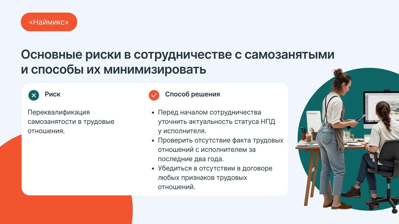
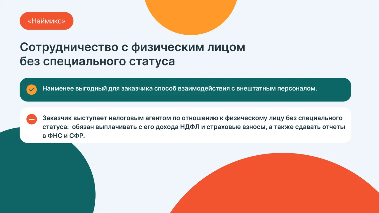
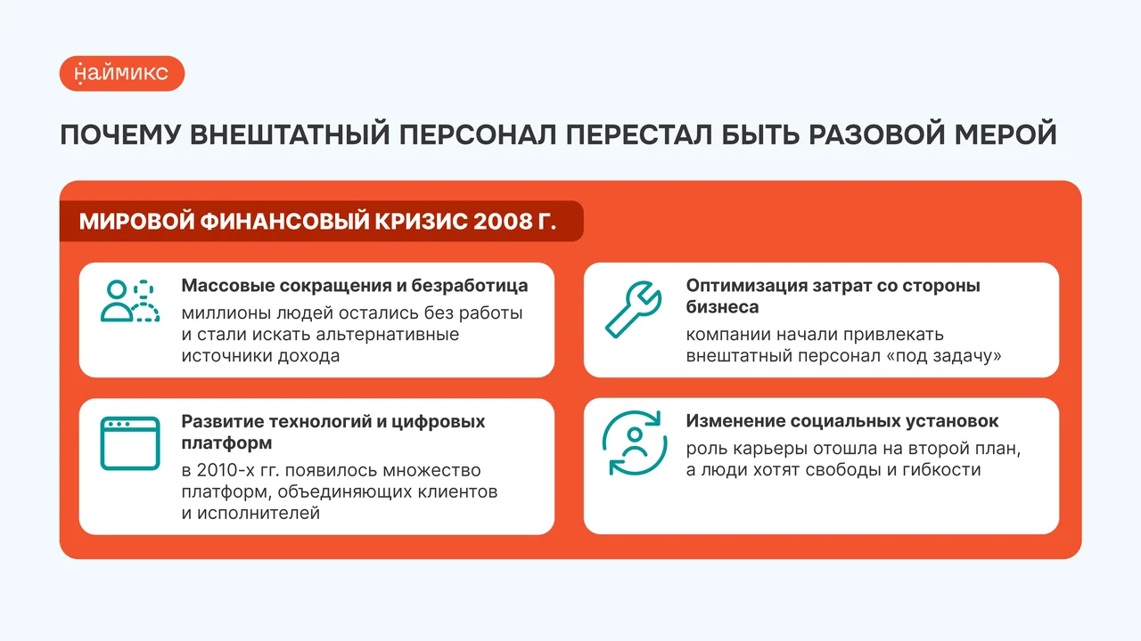
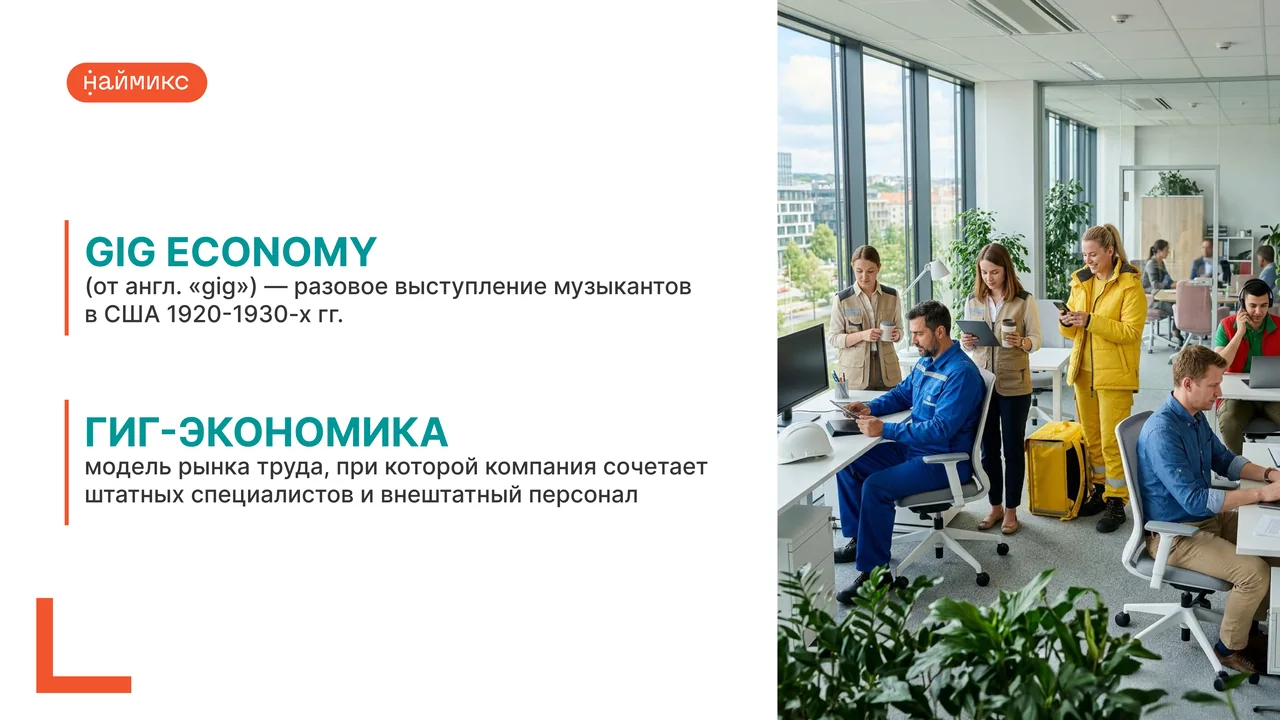
Work on the B2B presentation began with a review of the eight slides that existed before me. They did their job but looked like stock corporate material: disconnected blocks, mismatched illustrations, text you had to labour through. There was no single visual system, and the slides didn't read as one product.
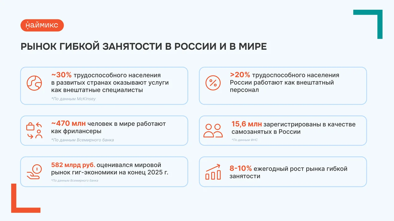
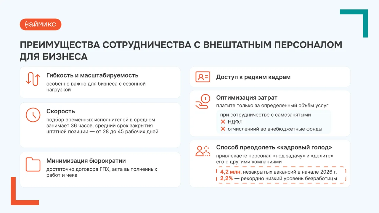
I rebuilt the structure and the visual language. A modular grid now holds the composition on every slide. Illustrations were brought to a single style, the palette became more restrained and deeper, the typography larger and clearer. Accents moved to the foreground, secondary content dropped to subordinate levels. Diagrams and data now read at a glance instead of needing to be decoded.
The result: the presentation became a coherent system where every slide serves the overall logic while solving its own task. The style became stricter, more professional and more fitting for a B2B audience that values clarity and attention to detail.





Warm design for students
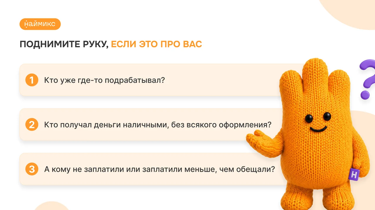
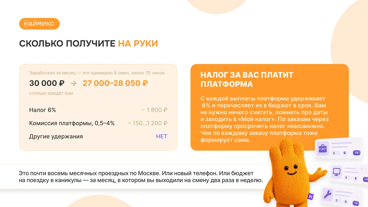
Students don't read long texts. So for the B2C presentation I looked for a different visual language. A knitted character — warm, orange, smiling — asks questions from the slide. It doesn't push or preach; it speaks as an equal. That sets the tone for the whole presentation.
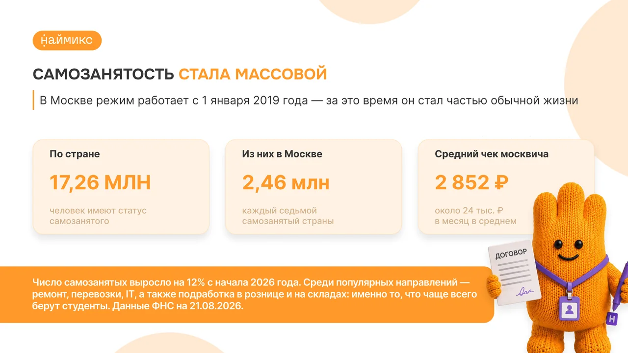
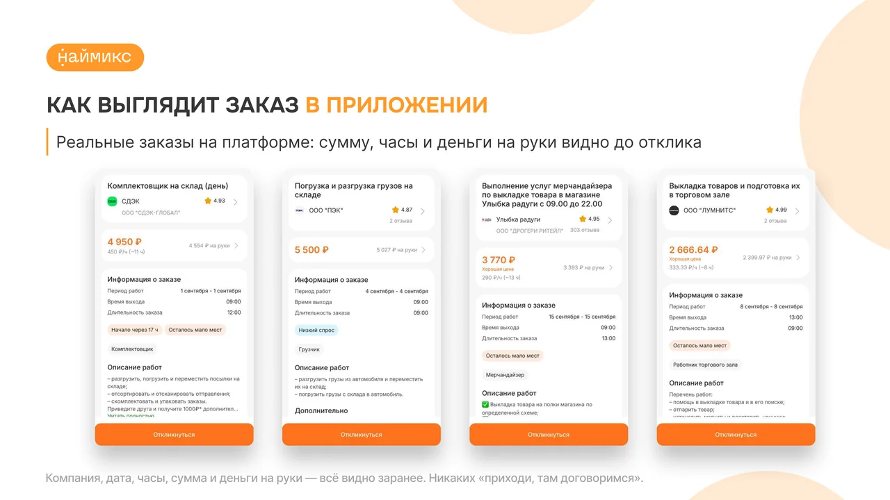
Then the numbers. Large, readable from a distance, set in dedicated blocks so they don't drown in text. UI screenshots are presented as real order cards rather than abstract illustrations. Everything is transparent and easy to grasp.
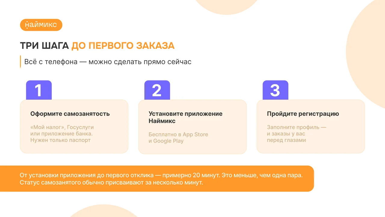
The step-by-step structure is built on large numbered panels that guide the eye. Visually everything sits in a warm range: orange, cream, soft shapes. The mascot appears on every slide but never steals attention — it supports, explains, smiles. The slides aren't overloaded, there's plenty of air and large typography. Even the numbers read from a distance and stick firmly in young minds.